Rewired

Social accountability 0 → 1 design

Rewired on mobile

Overview

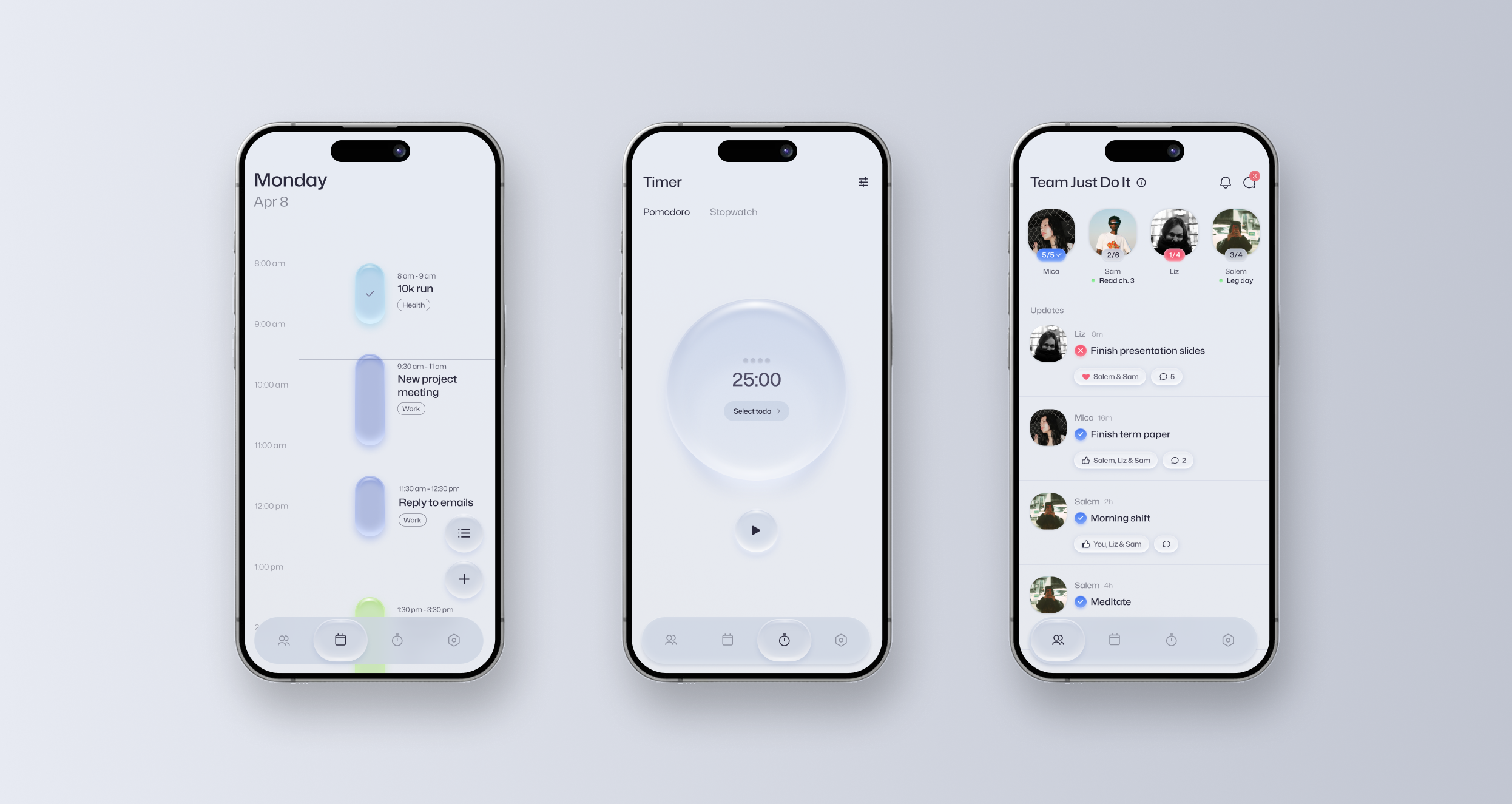
Rewired is a mobile app where users join accountability groups and help each other complete their daily tasks.

I was the sole product designer for the development of the Rewired app, designed end-to-end from conception to the final developer handoff.


The problem

Many people set out with good intentions, but struggle to follow through.

We’ve all experienced moments like this. But for some, procrastination becomes a persistent barrier to their personal growth. Our team started off with this general observation and explored the gap between intention and action.

Jump to solution ↓


Research

Procrastination is not simply laziness.

To explore this problem space, I started off with a literature review.

Research shows people avoid tasks as a way to manage the negative emotions associated with a task. This could be due to a fear of failure, task difficulty, not knowing what to do, anxiety, etc.

The need for accountability

An interview with 6 procrastinators revealed key insights…

1. It’s not about putting things off

Just like the literature said, procrastination was indeed a way to avoid facing negative emotions such as stress, uncertainty, or self-doubt.

2. The role of social accountability

External pressure from work, school, or others was consistently mentioned as a key motivator to helping participants stay on track.

3. A negative cycle

Failing to follow through on intentions triggers guilt and shame for procrastinators, trapping people in a negative cycle of procrastination.

An opportunity in the market?

Naturally, we wanted to see which solutions already exist to close the intention to action gap.

The market was saturated with tools for task management (checklists, timers, and habit trackers), but few solutions directly addressed the challenge of procrastination.

We were particularly interested to see any solutions that leverage social accountability to drive action, but surprisingly, there was little to none.

Competitor 1 Competitor 2 Competitor 3 Competitor 4

How might we help people overcome procrastination by creating supportive social accountability that keeps them on track?


Defining scope

Small accountability groups with daily tasks

I worked together with our team to explore a wide range of directions, from gamification, high-stakes punishments (betting money, for example), shared commitments, to live work sessions. We had to narrow our scope for product clarity and technical feasibility.

We decided on small accountability groups of 4 where users commit to daily tasks, share progress, and support each other.

Guiding factors for this decision:

1. Daily rhythm builds consistency

Focusing on daily tasks is a digestible commitment that can help people make steady progress and develop consistent habits over time.

2. Positive social motivation

Supportive relationships provide positive accountability, whereas competitive approaches like leaderboards and high stake penalties could worsen guilt and shame.

3. Groups reduce pressure

One-on-one accountability partnerships easily fail due to inconsistent check-ins, but groups reduce this dependency. Group sizes of 4 can create a community of accountability without being too overwhelming.


Solution Design

We identified a set of core features combining social accountability with tools for task execution, that make daily tasks easier to manage and complete.

Group Progress

Accountability groups typically use messaging platforms to manually check-in with each other. This can be overwhelming to manage and support others’ tasks throughout the day, especially when multiple people are involved. My goal was to create a system that makes this process effortless while maintaining gentle social pressure.

Frictionless accountability

I automated the process by posting task completion results to the shared feed as soon as they’re marked complete (or incomplete). This eliminates the need for “Did you finish this?” messages, shifting the group dynamic from progress reporting to social support.

This also creates natural opportunities for positive reinforcements through reactions and comments on the posts. The posts were designed to take up the majority of the screen to encourage users to support each other through post updates.

The group feed, with a member’s task marked complete The group feed, with reactions and comments on a post
The top bar showing each member’s progress

Progress

I utilized a top-bar layout to keep everyone’s total progress accessible in one place.

A member’s Live Status: reading chapter 3

Live Status

A “Live Status” indicator was introduced to signal when another member is currently working. Seeing others active can create a sense of shared focus that subtly encourages the user to mirror others’ productive behaviour.

This leverages the psychological principle of social facilitation, a tendency to perform better in the presence of others, which I recreated digitally. This is much like the boost in productivity people often experience when studying at a library vs. at home.

A member’s profile showing their daily plan

Plans

Each user’s profile displayed their daily plan in a list format. Unlike each user’s own daily planner that visualizes the day with time blocks, I chose to focus on quickly scanning what has been planned rather than when.

Manage tasks

Time blocking

Procrastination is affected by the Parkinson’s Law, stating that a task expands to fill the time available. When users perceive the entire day as their deadline, urgency vanishes. This perceived abundance of time leads to either procrastination or working slowly.

I countered this with time blocking. Forcing a commitment to specific start and end time replaces the option of ‘I’ll do it later’ with the immediate urgency of ‘now,’ compelling the user to act.

Visual design

I considered a standard to-do list, but chose to visualize time blocks in a timeline to emphasize the time commitments and their scale. To prevent a full schedule from looking overwhelming and intimidating, I intentionally constrained the time block width and utilized whitespace, reducing visual stress.

In early iterations, I displayed individual start/end times alongside the hourly axis. When testing schedules with short, back-to-back tasks, this layout was difficult to read due to visual clutter. I iterated this to only show hourly timestamps on the left axis, serving as reference points in time, while displaying the start and end time by the task block itself.

Tasks without a time block in a floating bar

No time block?

Although the design encourages users to add a time block for each task, not every task fits neatly into a time block. For theses cases, the tasks appear in a horizontally scrollable floating bar. This guarantees they remain accessible and unforgotten even though it has no allocated time.

Adding a task

Adding task

The experience of adding a task was balanced between efficiency and functionality.

To minimize interaction cost, I implemented smart defaults so that the date automatically sets to ‘Today’ and the category to the user’s default, reducing the taps required.

This way, users can focus on assigning a name and time block for the given task. Secondary features such as notes and sub steps were made optional and separated from other features.

A task’s detail view with a focus timer button

Straight to focus

To make it easier to act on a task, I added a focus timer button to the task detail view, that pre-loads the selected task and navigates users to the timer page.

Focus Timer
The focus timer

Execution gap

We had tools to plan and hold users accountable, but there was a gap in helping users execute tasks.

A focus timer was implemented because constraining work and breaks into short intervals (e.g., 25 min focus, 5 min break) lowers the barrier to entry, making daunting tasks feel approachable and reducing the emotional resistance that procrastinators often feel.

Stay in the flow

However, a structured timer can counterproductively force a break when a user has entered a flow state.

To solve this, I designed a flow extension mechanic. When the focus session ends, users are nudged in a 10 second window to click ‘Take break’. If no action is taken, the timer automatically switches to counting up.

This transition prevents the user’s focus from being cut off inorganically, effectively prioritizing task completion over time limits. This extension mechanic can be toggled off in settings.

The timer’s visual progress indicator

Progress indicator

During active sessions, I prioritized a visual progress indicator over a numerical countdown. Displaying the precise timer can often shift the user’s focus from the task to the passing seconds, transforming the tool from a focus aid into a source of stress and distraction.

A progress indicator obscures the exact time and visually gives an estimate of the remaining time, enough to keep the user aware of time without breaking their flow. I designed the timer so the precise timing can still be seen when the time is paused, as not to completely hide the precise time and frustrate the user.

The timer settings

Timer settings

I used progressive disclosure to hide timer configurations in the settings menu since users typically find a preferred workflow and stick to it, not requiring regular adjustments.


Reflection

Things didn’t go to plan

We aimed to release a lean product but kept adding features before launch out of eagerness. What felt like progress soon slowed us down, delaying testing. I saw how easily scope can creep up and derail timelines.

Although we realized a bit late, we focused our energy on building the app with what we had, while further developing other parts of our product such as marketing and branding.

Next steps

Our next steps are to validate our approach and polish any usability issues through user testing.

The priority lies in measuring whether users are following through on their tasks — daily. Are users able to translate their intentions into actions?


What I’ve learned

Adaptability in the design cycle

The reality of the design process was far less linear than ‘textbook’ frameworks. I learned to prioritize adaptability—tailoring our workflow to fit the team’s specific constraints and needs, rather than forcing to fit the process.

Thinking bigger

It was tempting to perfect each feature in isolation. However, by maintaining a holistic view, I was able to ensure that each feature amplified other features, resulting in a cohesive experience rather than a collection of disjointed tools.

Not getting attached to ideas

Very early into the project, I found myself becoming protective of designs because I had invested hours. When I detached myself from my work, I stopped defending ‘my’ designs and started objectively choosing the best options for the product.